Temperature
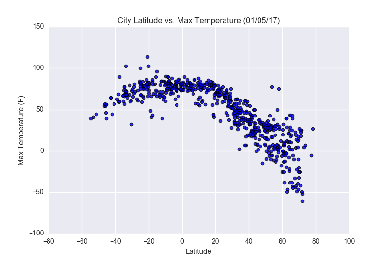
It is clear from the graph that temperatures are warmest near the equator. Also, the southern hemisphere is warmer than the northern hemisphere at the time the data was collected.
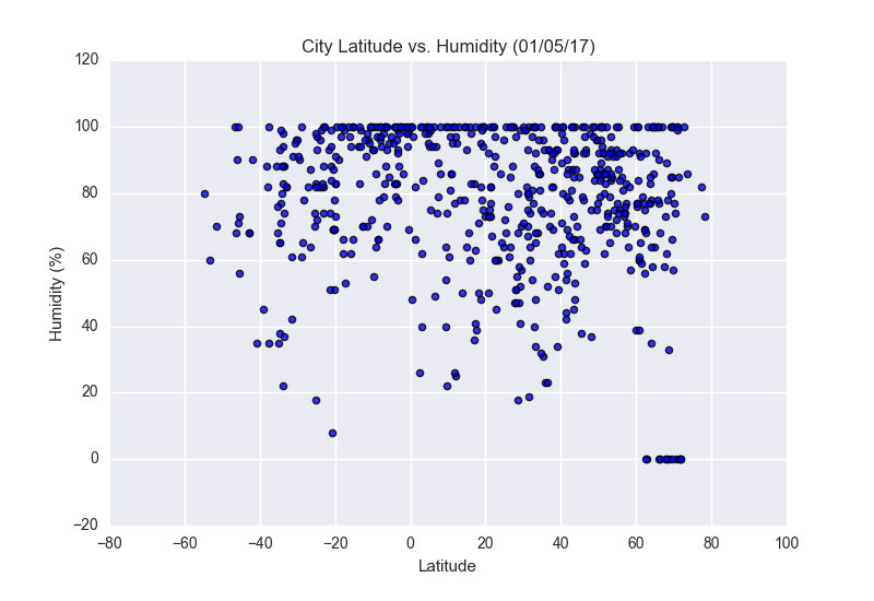
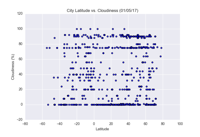
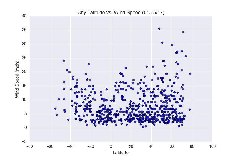
Visualizations